
Have you ever found yourself in the situation when you’re taking a great shot, but feel like something is missing? There is often that notion that the image just doesn’t keep your eyes where they are supposed to be.
Also, being aware of that you are biased on this matter when it comes to your photographs.
However, most often the trick is in the color and tones. You see, color is quite important when it comes to photographs, and quite a lot of photographers take it for granted.
There are many photographers seeking for that “cinematic” look, and I have to admit – I’m guilty of it too. But the trick is, there isn’t really a “cinematic” look.
Just movie directors who bothered to study color a bit more than your average photographer. When you think about it, many of the good photographers use the same principles in their photographs as the aforementioned movie directors, and it is probably one of the things that makes them stand out.
Make no mistake however – while one article isn’t enough to cover everything, it should serve as a guide for you to advance in that field. I will try to write more articles on this topic, so stay tuned.
1. Using The Color Palette
Color Palette is basically the most important thing when you are creating your photograph. Not to be confused with color grading, this is the part where you choose the primary colors that a picture will have.
Whether you’ll approach the image with contrasting colors, or with complementary colors – is up to you. The most important thing here, however, is that the colors need to be matched, and not to have too many of them.
Pick one primary and one secondary color, while the rest of the colors should be really dull, almost completely desaturated.
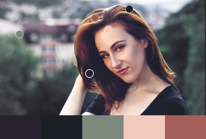
This way, the eye won’t wander around, but rather it will know exactly where the point of interest is. The saturation acts as a guideline, thus the more saturated an image is, the more attention it attracts from the viewer.
Note that instead of bumping up the saturation on the primary and secondary colors, reducing the saturation of the less important colors works better. Also, make sure that there is saturation difference between the primary and secondary colors.
2. Learn How To Desaturate Shadows
A trick that movie directors often use. When you play with the contrast, dark portions of the image often get oversaturated. This also saturates noise and often looks awful. The problem is, it's one of those issues where you know something is wrong, but you can’t really put your finger on it.

Since there is no slider or anything to affect shadows saturation particularly, you can do this with a few easy steps in Photoshop:
- Create a new layer
- Fill the layer with 50% gray.
- Set blending mode to “Color”
- Use blend if to blend the layer just to the shadows (If you aren’t sure how to use blend if, check out this tutorial)
- All done.
Additionally, you can crush the shadows a bit (add some widely known fade) – an effect you see in movies quite a lot.
3. Become Skilled At Color Grading
Color grading is used to add a certain mood to the picture. Think of blue tones in night scenes in movies, or pure white tones in high-tech environments in movies too.
Cinematography relies heavily on color grading to guide the viewer throughout the mood and feeling of each scene. Same can be done to photographs, and if done correctly, it will make the picture stand out. You can find tutorials for what color is used where, or just watch your favorite movies carefully and pay attention to the color of certain scenes you like.

Want to Understand Post Processing further still? Then check out these secret Lightroom tricks to really bring your images out of the dark!
Summary
Even though discussed over and over again, every improvement in regards to color will bring you a step closer to a photo that stands out. Researching it is also great for developing a certain visual style that will be recognized as your signature later on. Movies use these principles extensively, and their success is somewhat a testament to the usefulness of the craft.
Further Resources
- How to Make Your Photos Pop With Punchier Colors in Photoshop CC by Jason Row
- Want Untouchable Cinematic And Dramatic Shots? Master Color Grading: The Guide by Dzvonko Petrovski
- Great Movies About Photography by Federico Alegria


