Color is fundamental to composition in photography, and before anyone screams at me about black and white, it’s actually fundamental to that too. Colors can enhance our images depending on the way we use them. But how do we know which colors work together? Are there any color combinations we should avoid?
It can be very useful to look at the color wheel in case you are confused by various relationships between colors. The color wheel is a circular scheme that visually represents the relationships between colors.
The most common types of color pairings:
- primary colors
- secondary colors
- complementary colors
- analogous colors

The Primary Colors
The primaries are the building blocks as far as photography is concerned. Red, green and blue and combinations of these three will give us any other color. They are also the basis for our camera’s sensor – any pixel will either capture red, green or blue light. The amount of red, green and blue that these pixels capture and the fact that they are so tightly packed together is how our camera renders color in a digital image.
Much of the way we work with color in post-production is based around red, green and blue. Color profiles for cameras, screens and printing work with red, green and blue. It’s even one of the ways we can define an absolute color, by using RGB values. These numbers will reproduce the same color no matter what software we are using.
The primaries alone can give us very striking color contrast in our images. However, when we mix in the secondaries, we get even more creative possibilities.

The Secondary Colors
The photographic secondaries can be seen as the polar opposites to the primary colors. The secondary to red is cyan, to green is magenta and to blue is yellow. In film photography and in digital post-production we can use the secondaries to remove a primary cast. For example, if we have an image that is looking way too blue, we add yellow to make it look more natural.
This is particularly useful when correcting color casts in images. Shadows sometimes have a tendency to go a little blue. By adding yellow to the shadow tonal range we can counter that without compromising the entire image. Similarly, if we have a sunset sky that looks way too red we can add cyan to highlights to counter this.
Interestingly, images that combine red with cyan or green with magenta can be very jarring and uncomfortable to the eye, yet blue and yellow often complement each other well. Think of the number of sports teams that play in blue and yellow!

The Complementary Colors
Artists have known for hundreds of years that certain colors work well together, complement each other. Fortunately, there is a very easy guide to help us in deciding which colors are complementary. It’s called the color wheel and most versions of it show 12 colors. These are three primaries, three secondaries, and six other well-known colors.
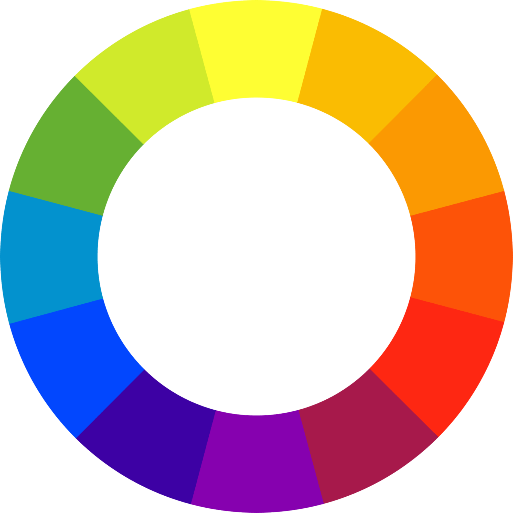
In order to find the most complementary color, you look at the opposite color on the color wheel. For example, if you were shooting a subject that was predominantly red and want to add in a striking contrast you would use green, the color opposite in the wheel.


Complementary colors provide a striking contrast and they are pleasing to the eye. We can use a combination of complementaries to draw attention to the subject.
The Analogous Colors
However, some colors that lie next to each other on the color wheel can also complement each other. Rather than providing a striking contrast, they work to produce a subtle and delicate difference that is particularly suited to low-key photographs or those with a muted palette.
Such colors are called analogous colors and they are groups of three colors that are next to each other on the color wheel. Red, orange, and red-orange are examples. The term analogous refers to having analogy, or corresponding to something in particular. An analogous color scheme creates a rich, monochromatic look.
This is especially true for the right side of our color wheel between red and green. The colors here might be considered pastel shades, subtle but very effective in compositions.


Color science in photography is complicated. However, by understanding the basics of the primary, secondary and complementary colors we can greatly enhance the way we take photos.
Understanding the way these color relate to each other is an extremely useful thing to learn and to practice. Next time you are out with your camera, take some time to look for combinations of colors that work well together.
Understanding color is just one of the limitless ways to get a powerful image. If you want to get a good grasp of advanced composition, then you should read Kent Dufault's Guide to Advanced Composition for an excellent grounding.
Further Reading:
- 20 Great Examples Of Vibrant Colors In Photography
- How To Use Colors In Your Portraits
- Slick Ways That Colors, Shadows And Shapes Can Transform Your Photography
- How To Make Your Photos Pop With Punchier Colors In Photoshop CC
- 6 Practical Ways To Unlock The Real Power Of Colors In Your Photography
- How To Color Grade Photos Like A Pro