There’s something about a black and white image, isn’t there? A good black and white stirs something inside us. It may create an emotion, make us question or simply step back in awe.
The problem is, shooting great black and white shots can be tricky. Perhaps the trickiest part is knowing whether a shot will convert well to black and white.
I am sure that, like me, many of you have converted shots that you might think would be great in black and white, only to be entirely disappointed with the end result. The thing is, whether you are converting an existing shot, or shooting a new one, black and white has some very specific requirement to work well.
Today, we are going to look at a few of them.
1. Scenes With Good Tonal Contrast
One of the primary factors that makes up a good black and white image is good tonal contrast. By that, we mean a range of tones from solid black through to pure white with several distinct mid-tones in the middle.
The best black and white images work when different tones are on different layers through the image. For example, the pure black may be just in the background, while the subject is composed of a series of lighter tones. Those lighter tones separate the subject from the background, giving depth, while the variation in the lighter tones provides us with texture.
Combing that depth and texture well can give us an almost three-dimensional look to our black and white photos.

2. Scenes With Contrasting Primary Colours
It might seem odd to suggest colour is essential in black and white, but it is, in fact, vital. Just as tonal contrast can give us depth, so can colour contrast. It also can help separate compositional elements within a scene.
The primary colours are the best to work within black and white, usually in pairs. Green and Red, Green and Blue and Red and Blue are all combinations that can give a striking colour contrast to a black and white image.
Another reason for looking for these primaries is how we work in post-production. Our editing software will work predominately with primary colours. That means that we can change the saturation and lightness of those individual colour channels even in black and white.
Decreasing the lightness of the blue channel, for example, will darken our skies. If we have fluffy white clouds in that sky, they will become more prominent. Increasing the lightness of green will lighten any foliage in a landscape, helping it stand out from other elements in the scene. Colour contrast is as important to black and white as tonal contrast.

3. Strong Directional Light
Light is, of course, important in all photos, but black and white images can benefit from strong directional light. This could be sunshine, flash or continuous light or reflected. By having an omnidirectional light source, we can cast shadows over our subject and background. This, in turn, creates a feeling of depth, similar to the use of good tonal contrast.
There needs to be some subtlety to the light. Too hard or harsh and those shadows will go black, revealing no details. A good directional light will cast strong shadows that can still exhibit texture and detail in a good exposure.
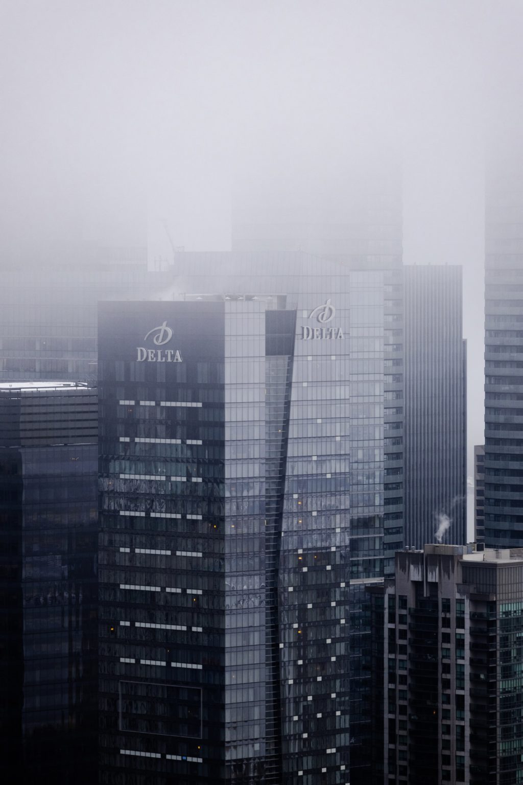
Strong directional outdoor light is a particular weapon in architecture and cityscapes. The geometry of modern life can create amazing shadows and textures.

4. Textures
Texture is another element that can make for a fantastic black and white image. Leading on from above, strong directional light passing at a deep angle over a textured surface can give us very compelling monochromatic images.
Textures are all around us, from the rust on an abandoned car to the knurls and swirls of the bark of a tree. These textures can make an interesting abstract subject on their own or be used as a compositional element to highlight a different subject. Low, strong but not harsh light from one direction will be your friend here.

5. Geometry
Mathematicians will tell there is a beauty in geometry and they would be right. For photographers, there is a special kind of visual beauty to geometrical subjects, one that is especially so when shot in monochrome.
Geometry is all around us but occurs more in human-made subjects than in nature. It can be as simple as the hard intersections of brutalist architecture to the subtle curves of a modern airport terminal.
The shapes formed in geometry give rise to light and shade. When we combine that with low directional light, those shapes cast shadows on themselves and create the perfect feel for black and white architectural shots. Move close, and the architecture can become abstract.
Geometry is one genre where even harsh light can work in black and white. So long as the lighter areas have texture and detail, the shadows can be pure black and the shot will still work.

Genres That Suite Black And White
Pretty much any form of photography can look great in monochrome, but some are more suited. Street photography is an obvious choice. Photographers can use tonal contrast to highlight a subject against a darker or lighter tone.
Architecture is another genre highly suited. The geometry of buildings, combined with directional light, can make very striking images.
Portraiture, of course, light subjects well, separating them tonally from the background and you will get great shots. Older subjects are particularly suited to black and white; the lines and ageing of their face can bring a sense of depth to the image.
Landscapes and seascapes work well, especially in stormy weather with contrasty light and foreboding clouds. Long exposure landscapes and cityscapes are both great subjects.
Final Thoughts:
So, what are the best elements to look for when shooting or editing a shot for black and white?
- Good tonal contrast
- Primary colours especially those that contrast each other
- Strong directional light
- Textures
- Geometry
Black and white can be tough to get right. It’s not as simple as taking a shot and making in monochrome in Lightroom or Photoshop. If planning to shoot specifically for black and white, look out for some of the conditions we detailed above.
If planning to edit existing images to black and white, the same applies. Either way, if your shot has some or all of these elements, there is a pretty good chance you will get a cracking monochrome image out of it.
Further Learning:
Make sure you take a look at Kent DuFault's Better Black And White Guide. This is a complete step by step guide to creating stunning black and white conversions – including teaching you everything you need to know about controlling tone and contrast to get the image you want.


8 Comments
Love the article and really enjoy shooting B&W.
Great tips and advice here, so thanks.
Just one point though – something that’s becoming a bit of a pet peeve with me because I see and hear it quite often. It needs to be noted that green is not a primary colour. It is the result of blending two primary colours- yellow and blue.
I think the digital influence is the cause of this since our screens render colours in RGB. People make this mistake a lot, but normally recall when they think about it that the primaries are red, blue and yellow.
Cheers!
K. Trudeau – red/blue/yellow are not “light color primaries”. They are “pigment color primaries”, described as “subtractive”, and not how the human eye perceives. The latter only applies to objects, like pigments and dyes. Since digital photography works with light and is displayed with a computer monitor (generally, for photo work), it uses the additive character of light, for which the primaries are RGB.
Here is a link that makes the two different mechanisms clear. https://learn.leighcotnoir.com/artspeak/elements-color/primary-colors/
K. Trudeau
My pet peeve also.
The principles of monochrome shooting are well covere d in this article. however, anyone who knows color will tell you that green is not s primary color! Its made up of a combination of blue and yellow, which are primary colors.
Was MOST informative ! Thanks !
Thanks, I am glad you liked it
Absolutely love this this article Jason. Very inspiring, as is your website.
Thanks
Thanks for your kinds words Chas, thanks also for taking the time to visit my website